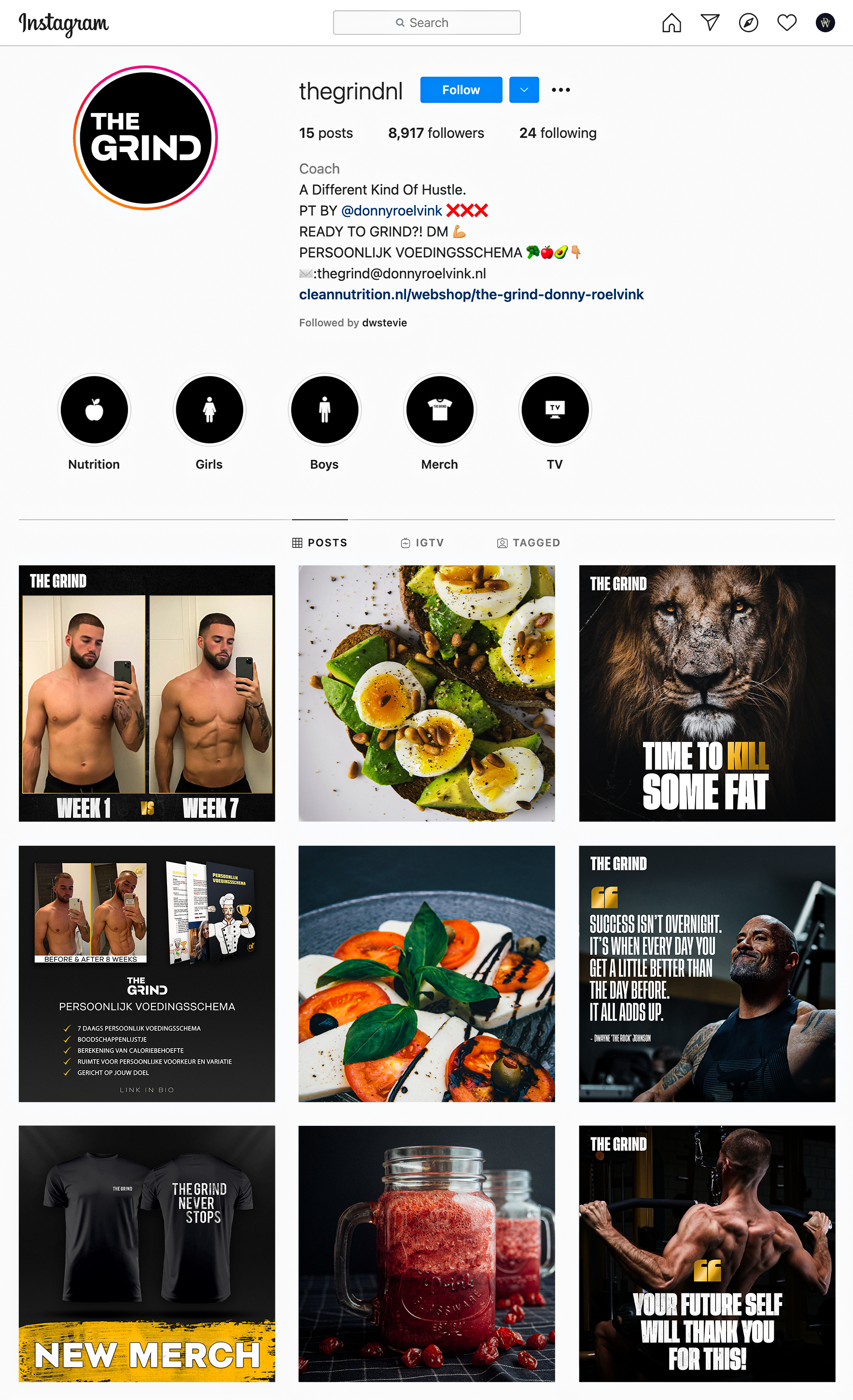
Social media makeover.
We created a concept for a social media makeover for Donny Roelvink’s new brand called THE GRIND, a gym lifestyle brand.
THE GRIND BRAND VALUES.
With THE GRIND Donny Roelvink tries to inspire and help people to become healthier, by exercising regularly and eating healthy. We believe these values are crucial to achieve that.
THE GRIND LOGO.
The logo derived from choosing the typography, we used a font called Montreux Branding which is designed to create these kind of logos. It is a bold logo which really makes a statement, yet it is refined which fits really well with their meal plans which also have to be refined to get the best results.
THE GRIND TYPOGRAPHY.
We chose Montreux Branding as font for headlines, a bold font to express strength and to make a statement, yet it is refined which fits well with the meal plans that they sell.
We paired Roboto with Montreux Branding for the body text, a very legible font.
THE GRIND COLOR PALETTE.
We chose a very straight to the point color palette to display the determination. We went for a darker yellow, as we wanted THE GRIND to be nr. 1 in this space and thus go for gold.
THE GRIND MOODBOARD.
We created a moodboard that expresses visually the brand values of THE GRIND. In the top left corner we have the gym, paired with healthy food in which the colors pop to make it look the most attractive, which then leads to living and adventurous life.
We also integrated the other values such as exercise and motivation at the bottom and used the same color theme to make clear what we want the branding to look like.


